Energising tech apprenticeships
Client
Baltic
Project
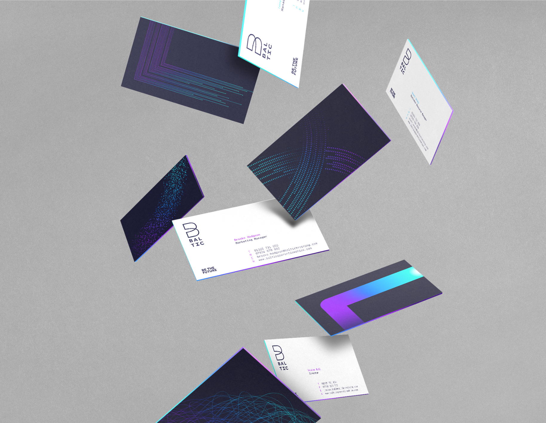
The Baltic Rebrand
Services
Sectors
The Brief
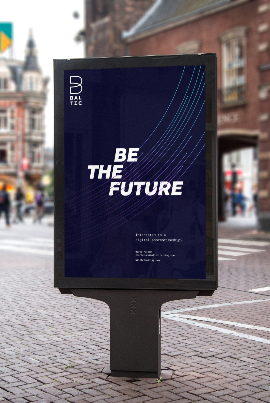
Baltic felt that their brand world was was inconsistent, outdated and felt a touch too male focused. Taking the lead from our refreshed and refocused brand story, we needed to visually energise, modernise and boldly express the potential of Baltic apprenticeships.
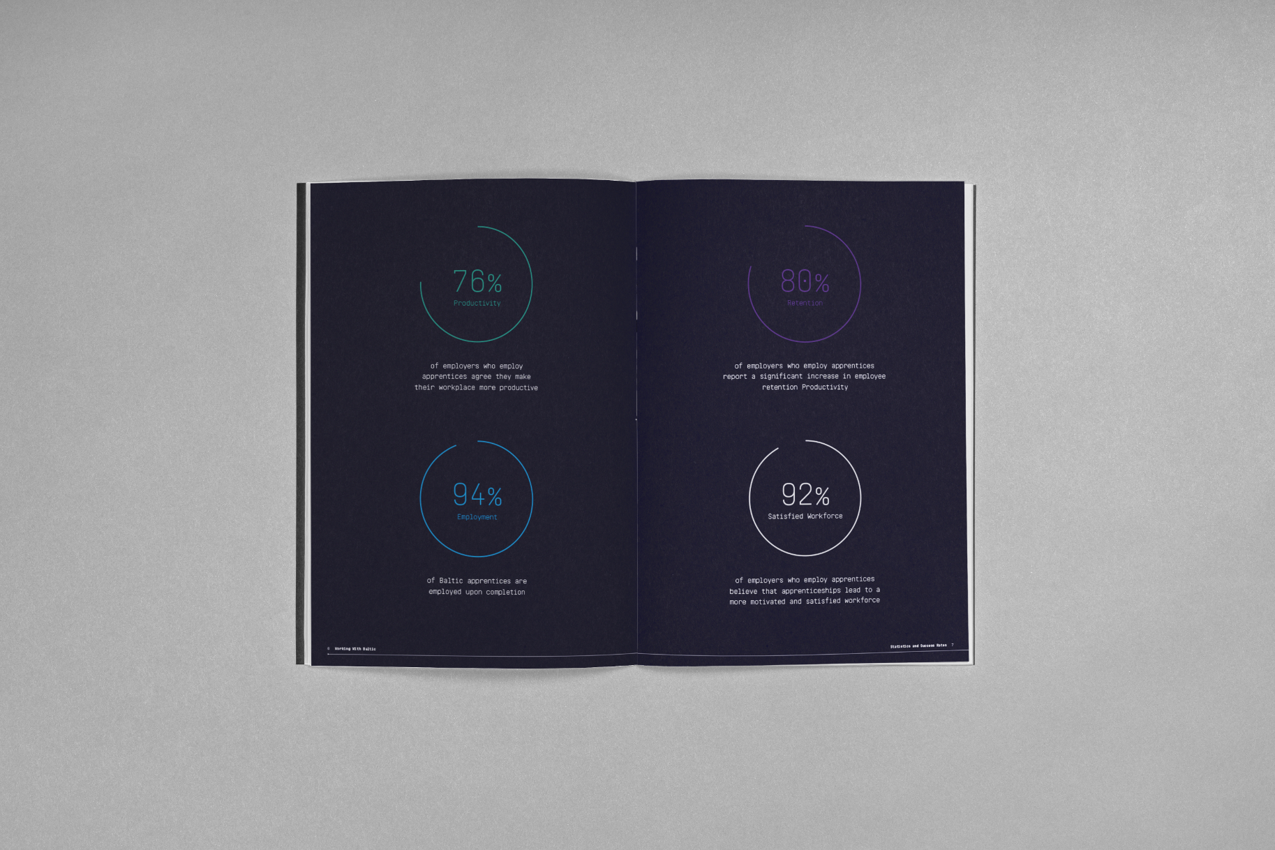
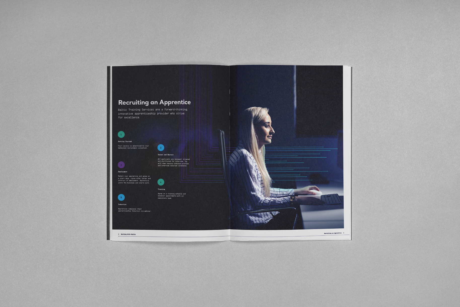
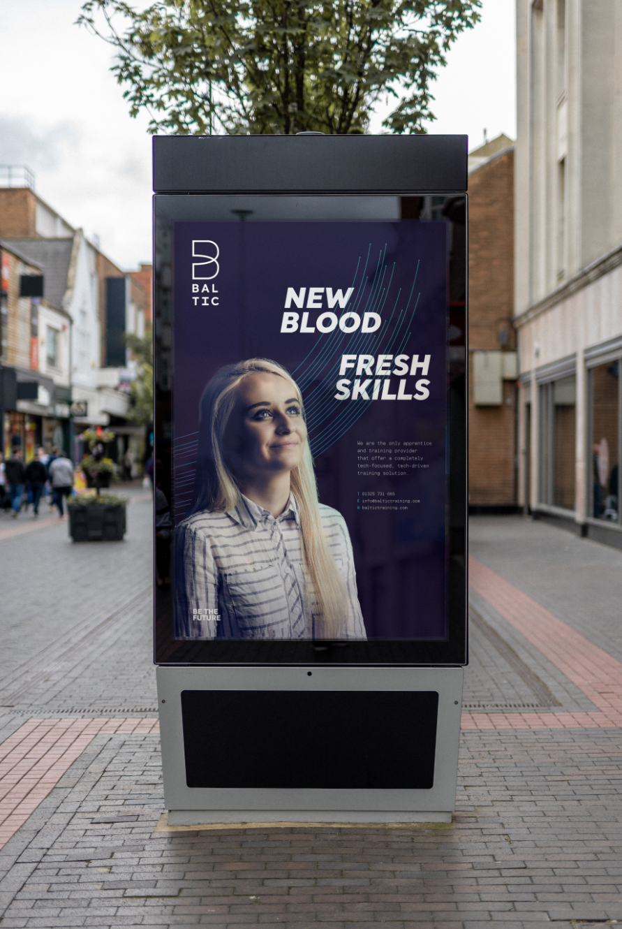
Baltic Training is a North East based apprentice and training provider focused on the IT and digital sector. They provide a completely tech-focused, tech-driven training solution backed up by an ethos of genuine care and a collaboration with one the world’s largest technology training providers.
The Solution
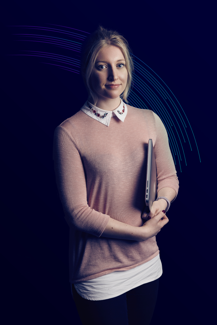
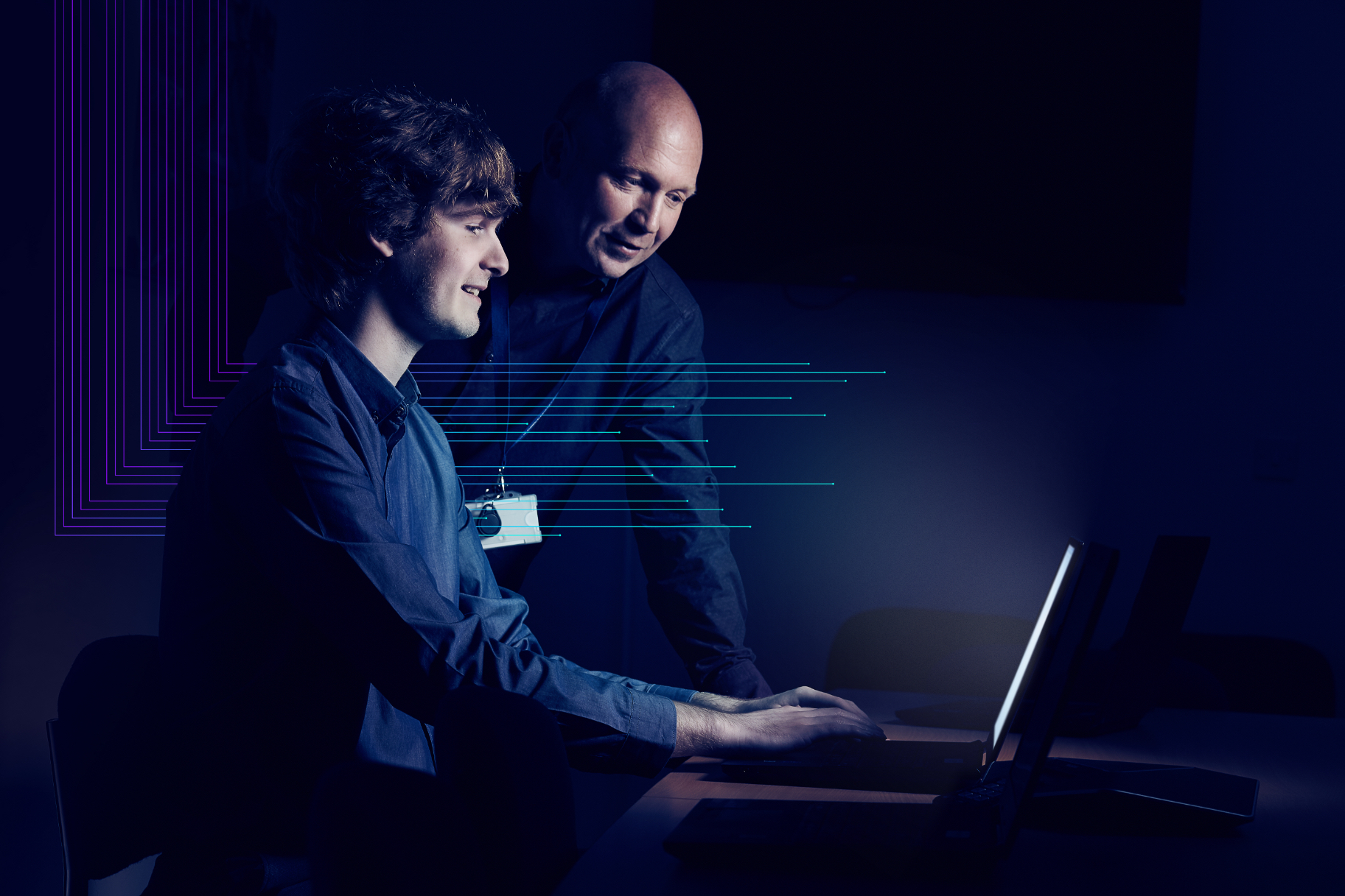
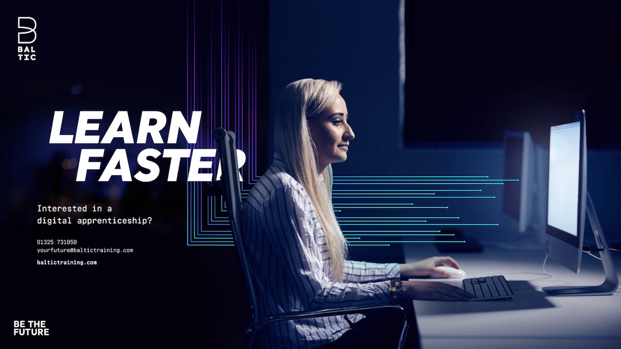
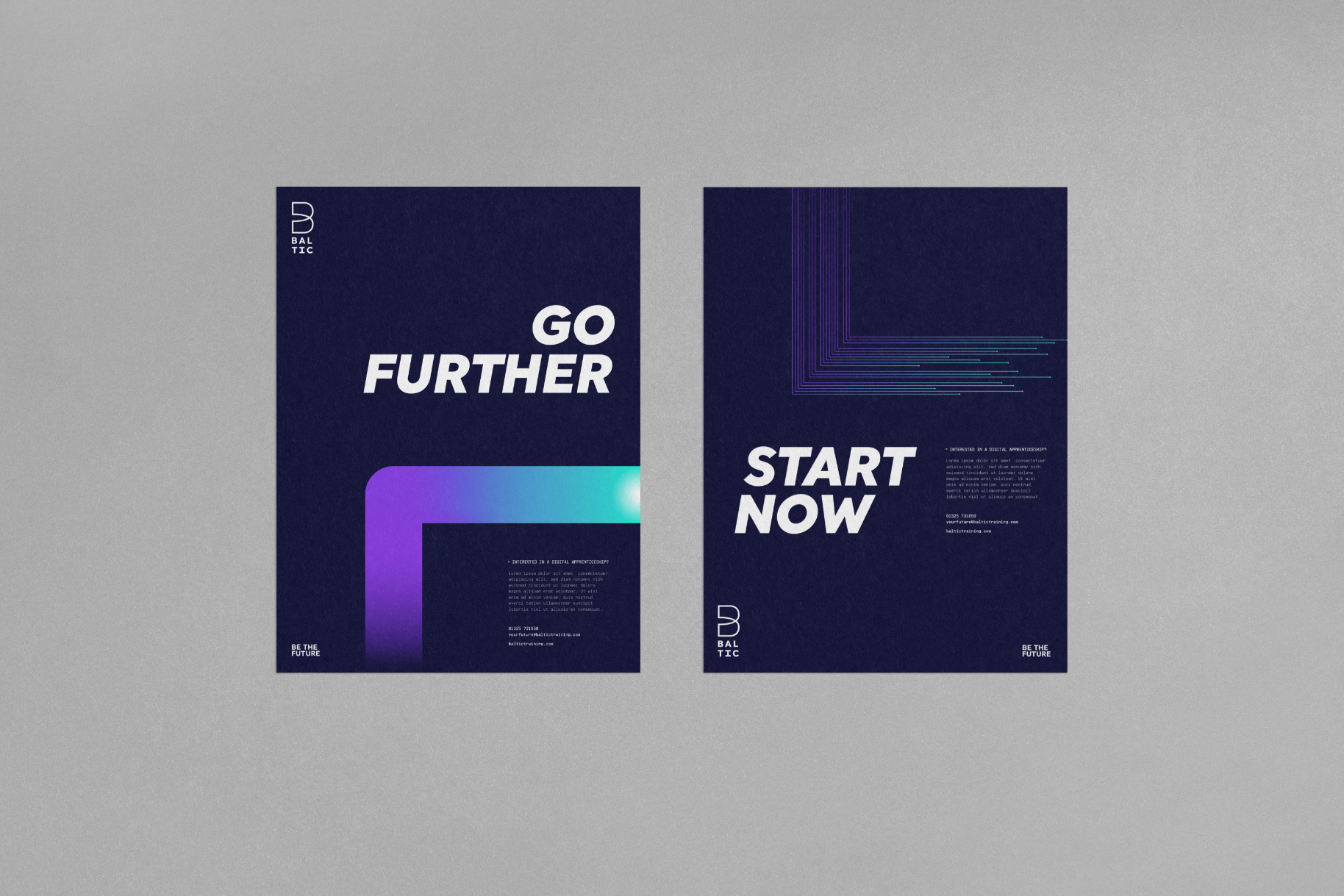
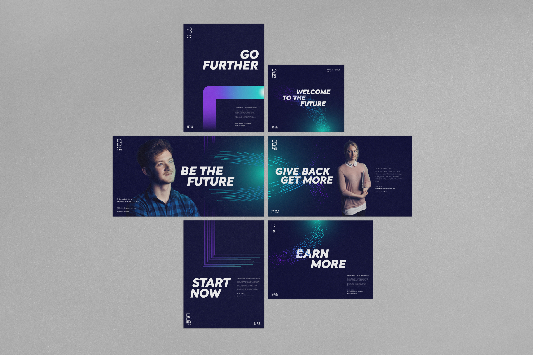
It is Baltic’s people and their passion that truly sets them apart from the competition. We wanted to express this by borrowing energetic and aspirational visual cues that would usually be seen in sports brands or consumer electronics. As well as communicating Baltic’s unique personality, we knew it was crucial to make technology apprenticeships look just as exciting as higher education.
Energising tech apprenticeships
The Brief
Baltic felt that their brand world was was inconsistent, outdated and felt a touch too male focused. Taking the lead from our refreshed and refocused brand story, we needed to visually energise, modernise and boldly express the potential of Baltic apprenticeships.
Baltic Training is a North East based apprentice and training provider focused on the IT and digital sector. They provide a completely tech-focused, tech-driven training solution backed up by an ethos of genuine care and a collaboration with one the world’s largest technology training providers.
Baltic felt that their brand world was was inconsistent, outdated and felt a touch too male focused. Taking the lead from our refreshed and refocused brand story, we needed to visually energise, modernise and boldly express the potential of Baltic apprenticeships.
It is Baltic’s people and their passion that truly sets them apart from the competition. We wanted to express this by borrowing energetic and aspirational visual cues that would usually be seen in sports brands or consumer electronics. As well as communicating Baltic’s unique personality, we knew it was crucial to make technology apprenticeships look just as exciting as higher education.

Infinite potential


Energise
“Better are just awesome, if you’re looking to rebrand, you definitely need to consider these guys. From the moment we sat down with Mark Easby, Director and Founder of Better, I knew this was the right agency to go with. Up until now, our brand hasn’t reflected what we do at Baltic, and it doesn’t really have a relation to the new service we provide. For me, I wanted to use this rebrand to get the passion and enthusiasm that is presented by our employees daily, across to external customers, and Better picked up on this straight away. Better don’t just look at the cosmetics of a brand, they want to know who the company are, who are their employees, what do their employees think of the business, who are their customers? By gaining this much insight into our company, Better were able to uncover the essence and heart of our business and then used this to develop a brand to represent our values and mission. The knowledge, skill set and creativity that Better has is so inspiring, and I genuinely can’t thank them enough for helping develop our new brand.”
Brooke Hodgson
Marketing Manager, Baltic Training
Look to the future